Simplifying by.U’s onboarding and activation for new customers
This work is part of the by.U Indonesia migration onto Circles’ platform, a brownfield transformation requiring improvements within an existing product and onboarding flow.
This case focuses on improving first-time user activation and reducing drop-off during onboarding.
Problem
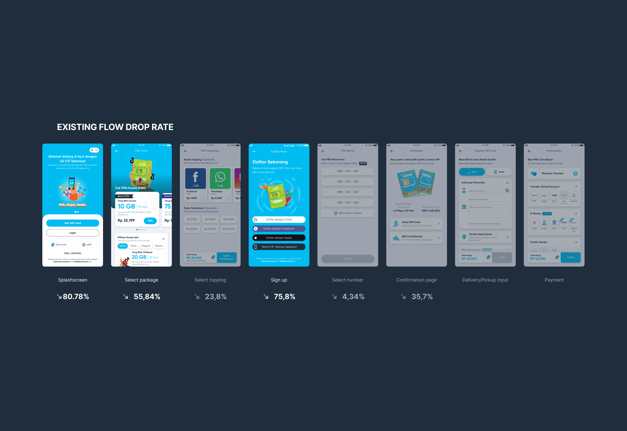
The onboarding funnel showed significant drop-offs at key stages:
Splash screen: 81% drop-off
Select package: 56% drop-off
Sign-up: 76% drop-off
Key issues identified:
Mismatch between user intent and UI hierarchy
Most users opened the app to log in, but the interface prioritised “Buy SIM Card”Cognitive overload in plan selection
Too many options made it difficult for users to decide quicklyUnexpected sign-up interruption
Users were prompted to create an account mid-flow, creating confusion and friction
Approach
We focused on:
Reducing cognitive load and aligning the flow with actual user behaviour
Key principles applied:
Reduce number of steps
Improve hierarchy and clarity
Guide users progressively through decisions
Solution
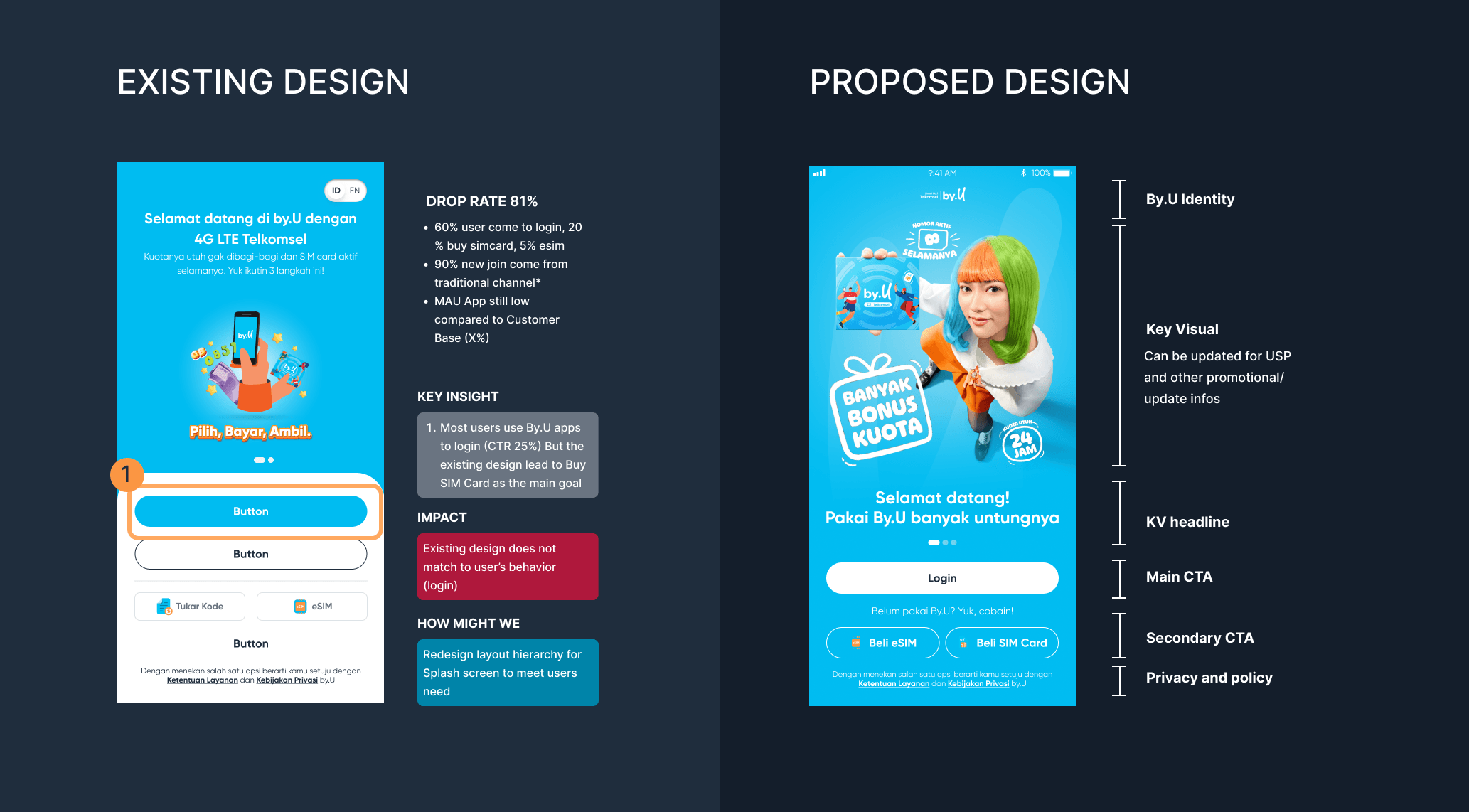
1. Aligning splash screen with user intent
Rebalanced CTA hierarchy to prioritise login
Structured layout to better reflect user entry behaviour
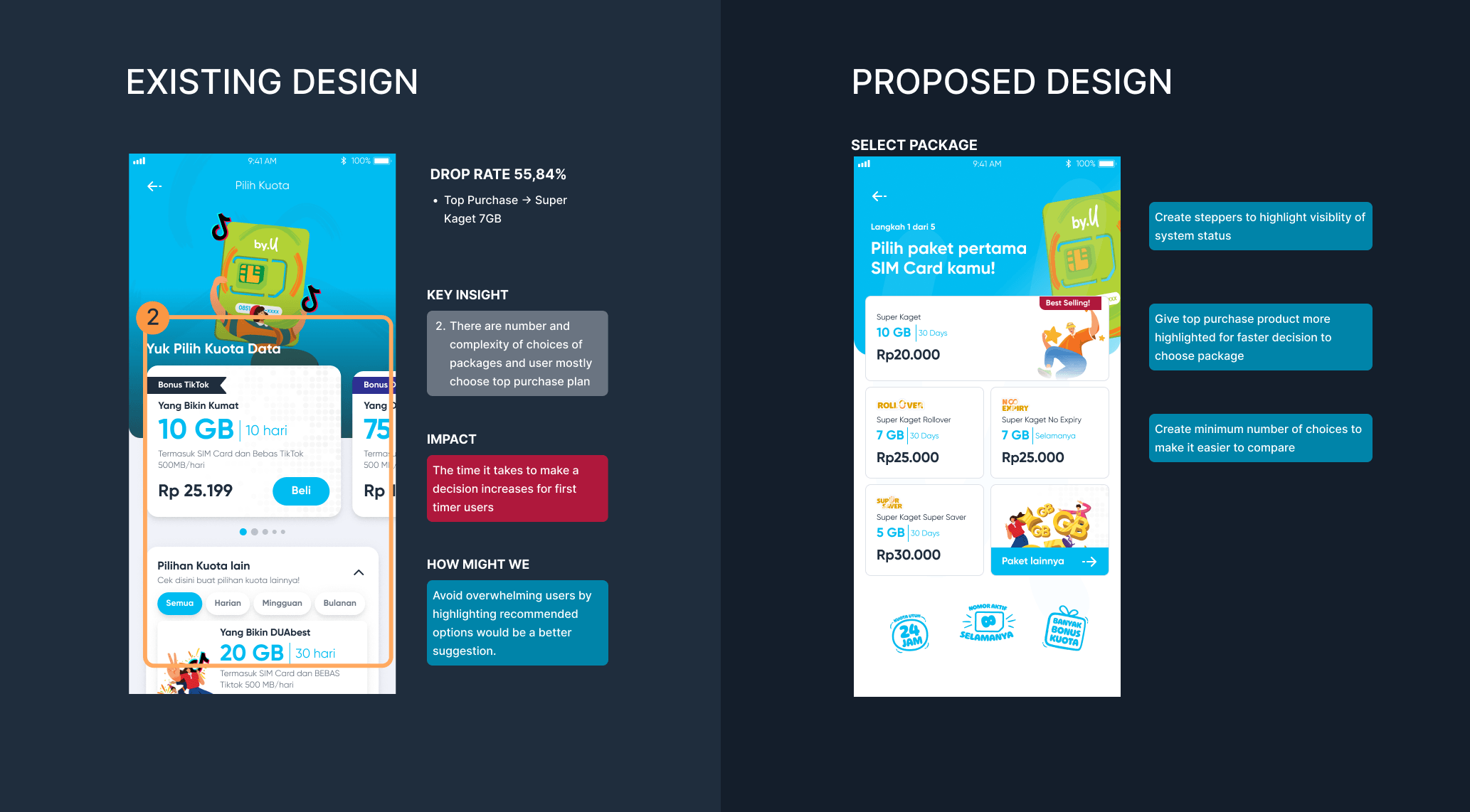
2. Simplifying package selection
Highlighted best-selling plans to guide decision-making
Reduced visible options to minimise comparison fatigue
Moved add-ons (“toppings”) into a secondary layer
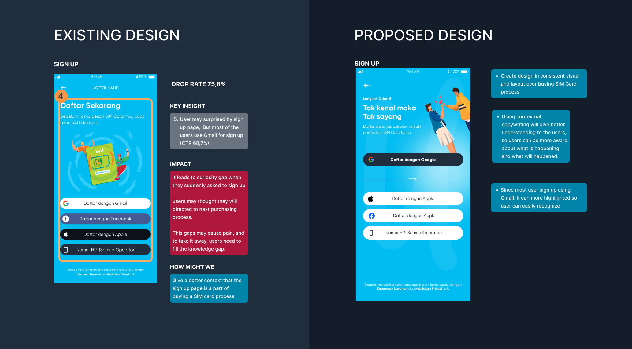
3. Improving sign-up experience
Added contextual copy to explain why sign-up is required
Prioritised Google sign-in based on usage data (~69%)
Maintained business requirement for early account capture
4. Streamlining downstream steps
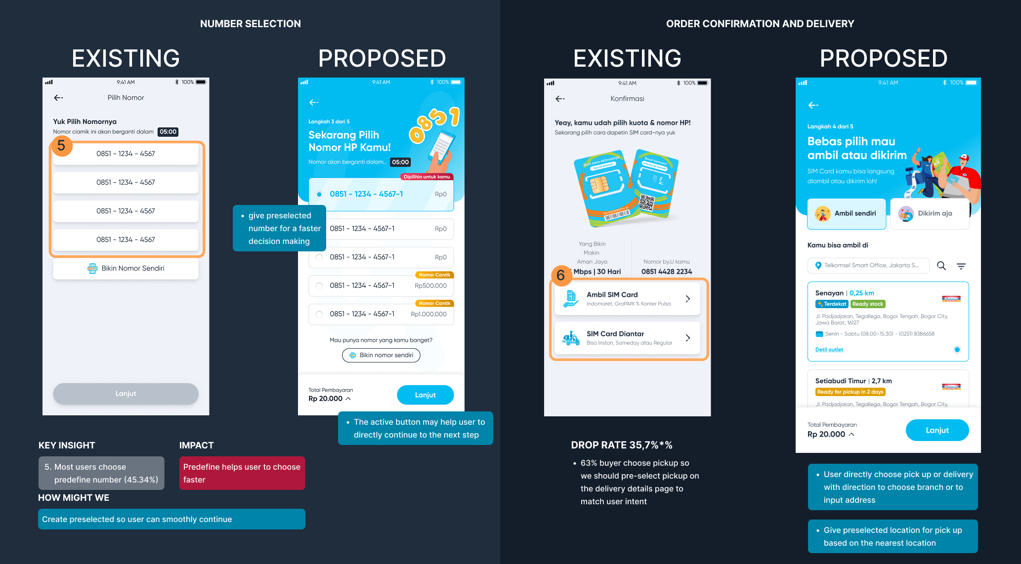
Preselected phone numbers to reduce decision friction
Merged delivery and confirmation logic for smoother progression
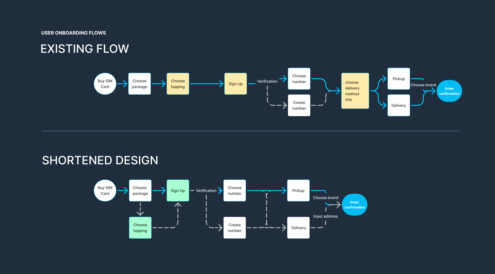
5. Reduced steps as much as possible
Removed topping selection as a standalone page
Reduced total onboarding steps from 8 → 6
Validation
We conducted usability testing in two phases:
Phase 1: Proxy users (interns) for rapid validation
Phase 2: Iteration based on observed behaviours
Key findings:
Users were able to complete onboarding with minimal guidance
Reduced hesitation in package selection
Improved clarity in sign-up and delivery steps
SEQ Score: 6.8 / 7 (high perceived ease of use)
Outcome & Reflection
Reduced onboarding complexity (8 → 6 steps)
Improved flow clarity and decision-making speed
Validated design direction through usability testing
Secured stakeholder buy-in to proceed with implementation
This work served as a foundation for aligning product, design, and engineering teams, and helped shift discussions from opinion-based to evidence-based decisions.